Since Bitcoin’s inception in 2009, due to the founder’s loss of faith in the traditional financial system and centralized control of currency, Bitcoin has grown significantly in value. However, due to its high volatility, investors have explored and utilized various methods to predict its price. One of the simplest and oldest methods is the Bitcoin Rainbow Chart.
Contents
- 1 What is the Bitcoin Rainbow Chart?
- 2 Who Created the Bitcoin Rainbow Chart?
- 3 How to Read the Bitcoin Rainbow Chart
- 4 Pros and Cons of the Bitcoin Rainbow Chart
- 5 Can the Rainbow Chart be used with other cryptocurrencies?
- 6 Event of the Bitcoin Rainbow Chart Adding a New Color Band
- 7 Is the Bitcoin Rainbow Chart Really Accurate?
What is the Bitcoin Rainbow Chart?
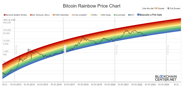
The Bitcoin Rainbow Chart is a multi-colored chart used to assess Bitcoin’s price. It’s like a rainbow, with each color representing a different meaning, from crypto bubble states to prices at which one should buy.
The Bitcoin Rainbow Chart is a basic logarithmic regression chart, used as a long-term valuation tool for Bitcoin. With nine rainbow color bands overlaying the logarithmic growth curve, this chart highlights market psychology at different price stages, suggesting potential opportunities to buy, sell, or hold Bitcoin.

The Bitcoin Rainbow Chart has been proven to be an effective method for measuring market changes, data, and Bitcoin’s long-term price volatility. As the daily cryptocurrency volatility is not considered, the Bitcoin Rainbow Chart is mainly used as a fundamental tool for long-term investment planning in the cryptocurrency world.
You can find the Bitcoin RainBow Chart at:
- https://www.blockchaincenter.net/en/bitcoin-rainbow-chart/
Who Created the Bitcoin Rainbow Chart?
The Bitcoin Rainbow Chart was first created in 2014 by a Reddit user named “Azop,” and he posted it online. It was designed in an interesting way to display BTC price trends over the years. The chart is so colorful and accurate that it was named the Bitcoin Rainbow Chart.

How to Read the Bitcoin Rainbow Chart
The Bitcoin Rainbow Chart consists of 9 rainbow colors. Each color has the following meanings:

- Deep Red – The bubble is about to burst, sell as quickly as possible. Bitcoin is overpriced. Do not buy Bitcoin at this time.
- Red – Investors should start selling now. Bitcoin is in a bubble and is overpriced. Do not buy Bitcoin at this time.
- Dark Orange – New investors are FOMOing. Bitcoin is overpriced and likely to drop in price. Do not buy Bitcoin at this time.
- Orange – The cryptocurrency market is starting to heat up. Investors should research and verify if the market is in a bubble.
- Yellow – A good time to remain neutral and hold Bitcoin.
- Light Green – Bitcoin is priced quite high but may still have a lot of growth potential.
- Green – A good time to accumulate and hold Bitcoin. This is when Bitcoin is stably priced. Investors should start buying now.
- Sky Blue – BUY BITCOIN. A good time to buy Bitcoin when it is undervalued and has growth potential.
- Sea Blue – Bitcoin has significantly dropped in price – This is the best time to buy Bitcoin at its lowest point.
Can the Rainbow Chart be used with other cryptocurrencies?
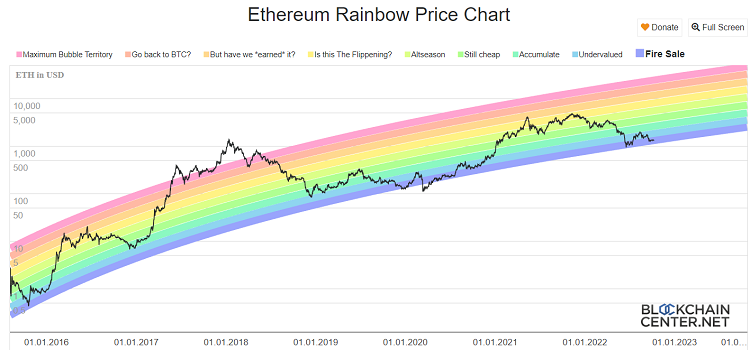
Besides Bitcoin, the Rainbow Chart can also be used with other cryptocurrencies, notably Ethereum.
You can look up the Ethereum Rainbow Chart at:
- https://www.blockchaincenter.net/ethereum-rainbow-chart/

However, looking at the bigger picture, the actual price of Ethereum slightly differs from what the Rainbow model predicted. On March 12, 2020, Ethereum’s price was even adjusted lower than the purple band.
Event of the Bitcoin Rainbow Chart Adding a New Color Band
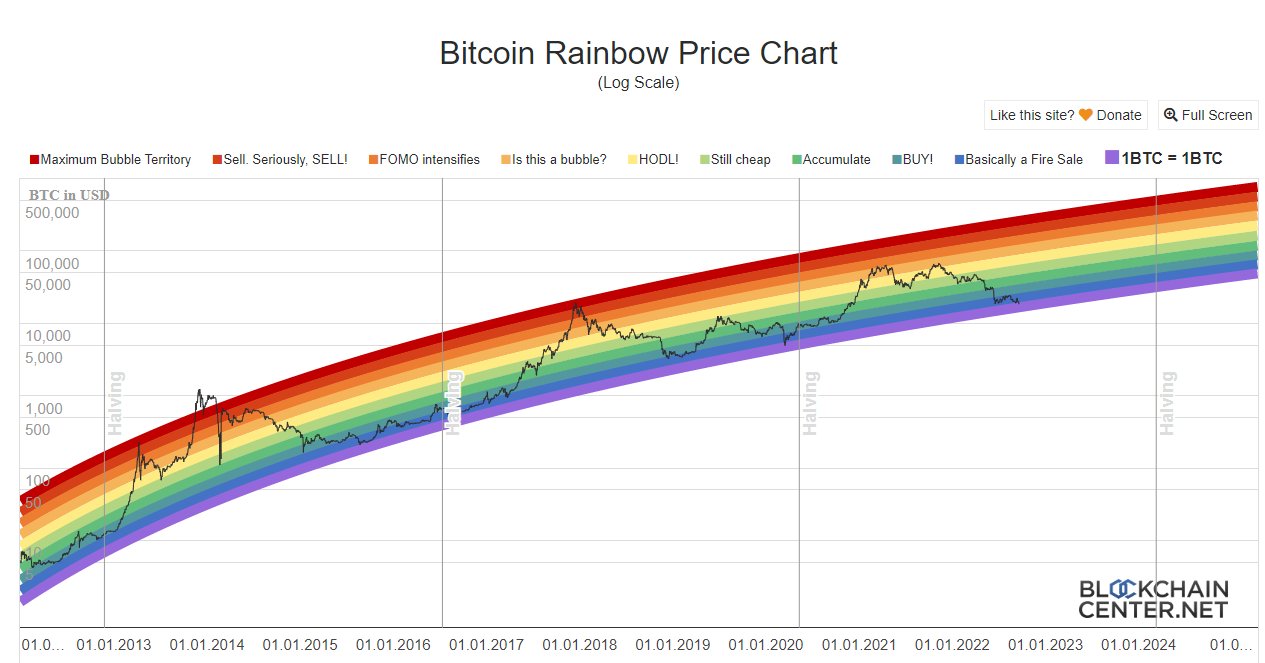
On September 19, the Bitcoin Rainbow Chart was updated with a new color band. The reason is believed to be that the Bitcoin price broke through the lowest band of the chart. “1BTC = 1BTC”. This also signals that Bitcoin may continue to decrease in price in the future.

According to data since 2011, BTC’s price has never gone below the bottom blue line of the rainbow. This could be the first time!
However, the move to add a new color band to the Bitcoin Rainbow Chart has been sarcastically criticized by many Twitter users, claiming that Bitcoin Rainbow is “dead,” and this is a “desperate effort” to maintain the chart’s value.
Lol!! ???? rainbow ???? chart just updated a lower bound called 1 #btc = 1 #btc ????https://t.co/T1hnYlQlGK
— Bruce ????????????????????????????♀️ (@omgbruce) September 19, 2022
Is the Bitcoin Rainbow Chart Really Accurate?
If you want an easy way to make investment decisions on buying or selling Bitcoin, the truth is that you cannot rely on the Bitcoin Rainbow Chart. Although the Bitcoin Rainbow Chart has proven to be an effective measure of market changes and volatility since its creation in 2014, it is not an effective predictor of Bitcoin’s future price.
Specifically, the Bitcoin Rainbow Chart only tells you whether the current price of Bitcoin is expensive or cheap compared to past data.
According to the Bitcoin Rainbow Chart, after each Bitcoin Halving event, the price of Bitcoin is adjusted upward, reaching a peak growth about every 3-4 years. Similar trends could occur in the future, allowing investors to make predictions about Bitcoin’s price. The next Bitcoin Halving is expected to take place in mid-2024.
However, past price fluctuations do not necessarily correlate with future performance. Although the Bitcoin Rainbow Chart has been proven to be an effective measure of market changes and volatility since its inception in 2014, the chart is entirely unscientific and can change without warning. Furthermore, as Bitcoin is overpriced, any small fluctuation can have a significant impact. For instance, with the price at the time of writing being 20,266 USD, a 1% drop in Bitcoin equates to a 202 USD decrease.
To understand how the Bitcoin Rainbow Chart can be useful as you develop your investment strategy, it is best to compare it with other long-term trading indicators. A tool commonly used by cryptocurrency traders is the Relative Strength Index (RSI).

The RSI allows traders to determine when the price of an asset is not close to its “real” value, giving traders a chance to make investment decisions before the market reacts. The RSI indicator displays a value ranging from 0 – 100. If the RSI has risen above 70, this indicates that Bitcoin is being overbought, meaning it is a good time to sell before the price falls. Conversely, if the RSI is below 30, it signals that Bitcoin is in an “oversold” state.
SUMMARY:
In general, the Bitcoin Rainbow Chart is quite a useful tool for investors at a certain point in time. Understanding long-term trading indicators and price trends related to Bitcoin and other cryptocurrencies will always make you a wiser investor. However, past price volatility does not necessarily correlate with future performance. If you decide to use the Bitcoin Rainbow Chart, ensure that it is not the only tool you use for investing. I wish you wisdom and success in your investments.
Readmore: Top 10 USEFUL Bitcoin Indicators – You Might Not Know


