When reading an article analyzing, predicting the price, or trends of Bitcoin, you might find analysts using some unique charts and indicators specific to Bitcoin, which are quite “unfamiliar,” different from the technical analysis tools you usually learn about such as MA, RSI… These indicators are built on Bitcoin’s on-chain data, and if you know how to utilize these Bitcoin indicators, they can be very helpful for you.
In this article, I will introduce to you the 10 most common, most useful Bitcoin indicators, widely used by analysts. Surely after reading, you will find them extremely simple, not complicated, and can easily read – understand – master them in just a few minutes. Let’s explore them together.
Contents
- 1 Top 10 Useful Indicators for Bitcoin
- 1.1 Bitcoin Rainbow Chart
- 1.2 Stock-to-Flow Model
- 1.3 Bitcoin MVRV Z-Score Indicator
- 1.4 2-Year MA Multiplier Indicator
- 1.5 200 Week MA Heatmap Indicator
- 1.6 Net Unrealized Profit/Loss (NUPL) Indicator
- 1.7 Bitcoin AHR999 Indicator
- 1.8 RHODL Ratio Indicator
- 1.9 Bitcoin Reserve Risk Indicator
- 1.10 Active Address Sentiment Indicator (AASI)
Top 10 Useful Indicators for Bitcoin
Bitcoin Rainbow Chart
- Link to view the indicator: https://www.blockchaincenter.net/en/bitcoin-rainbow-chart/
Bitcoin Rainbow Chart one of best Bitcoin indicators, is a multi-colored chart used to assess the price of Bitcoin. It’s like a rainbow, with each color representing a different meaning, and is considered a long-term valuation tool for Bitcoin. With 9 rainbow color bands overlaying the logarithmic growth curve, this chart highlights market psychology at different price stages. It suggests potential opportunities to buy, sell, or hold Bitcoin.
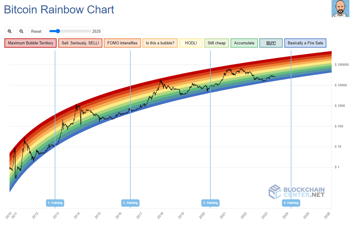
Bitcoin Rainbow Chart – Bitcoin Rainbow Chart includes 9 rainbow colors. Each color has the following meanings:

- Dark red – Bubble about to burst, sell as soon as possible. Bitcoin is overvalued. Do not buy Bitcoin at this time.
- Red – Investors should start selling now. Bitcoin is in a bubble and overvalued. Do not buy Bitcoin at this time.
- Dark orange – New investors are FOMOing. Bitcoin is overvalued and likely to drop in price. Do not buy Bitcoin at this time.
- Orange – The cryptocurrency market is starting to heat up. Investors should research and verify whether the market is a bubble or not.
- Yellow – (short for “Hold on for Dear Life”). This is a good time to be neutral and hold Bitcoin.
- Light green – Bitcoin is priced quite high but may still have a lot of potential for growth.
- Green – A good time to accumulate and hold Bitcoin. This is when Bitcoin is priced stably. Investors should start buying now.
- Sky blue – BUY BITCOIN. A good time to buy Bitcoin when it is underpriced and has growth potential.
- Ocean blue – Bitcoin has dropped sharply in price – This is the best time to buy Bitcoin when the price is at its lowest.
Stock-to-Flow Model
- Link to view the model: https://www.lookintobitcoin.com/charts/stock-to-flow-model/
The Bitcoin Stock to Flow model is a linear regression mathematical model that helps predict the price of Bitcoin, based on the correlation between Bitcoin’s price and its scarcity. The higher the scarcity, the greater the demand, and the higher the price, and vice versa.
Bitcoin Stock to Flow is based on data related to Bitcoin Halving. After each Halving, the block reward (reward for miners) of Bitcoin is halved, increasing the scarcity of this asset. Bitcoin’s annual inflation rate will gradually decrease to 0 after 32 Halvings. From this information, Bitcoin Stock Flow predicts that Bitcoin’s price can steadily increase with a profit of about x10 every four years.
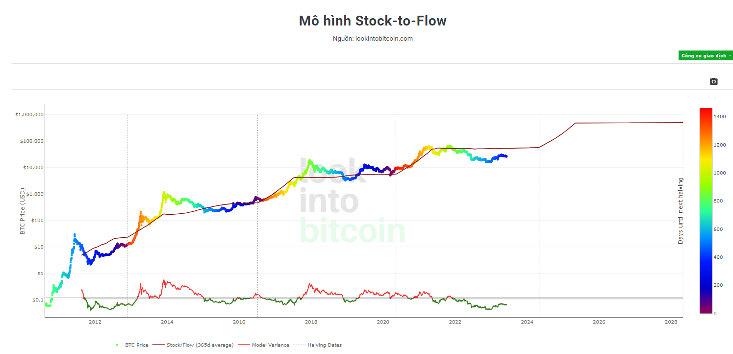
=> However, the Stock to Flow model does not account for all aspects related to Bitcoin’s price, including the macro market and unexpected factors. The results from this model are only for reference and not 100% accurate, so I advise you not to rely too much on this model.
Bitcoin MVRV Z-Score Indicator
- Link to view the indicator: https://www.lookintobitcoin.com/charts/mvrv-zscore/
The MVRV Z-Score is a Bitcoin chart used to determine times when Bitcoin is overvalued or undervalued compared to its “fair value.” It uses three metrics:
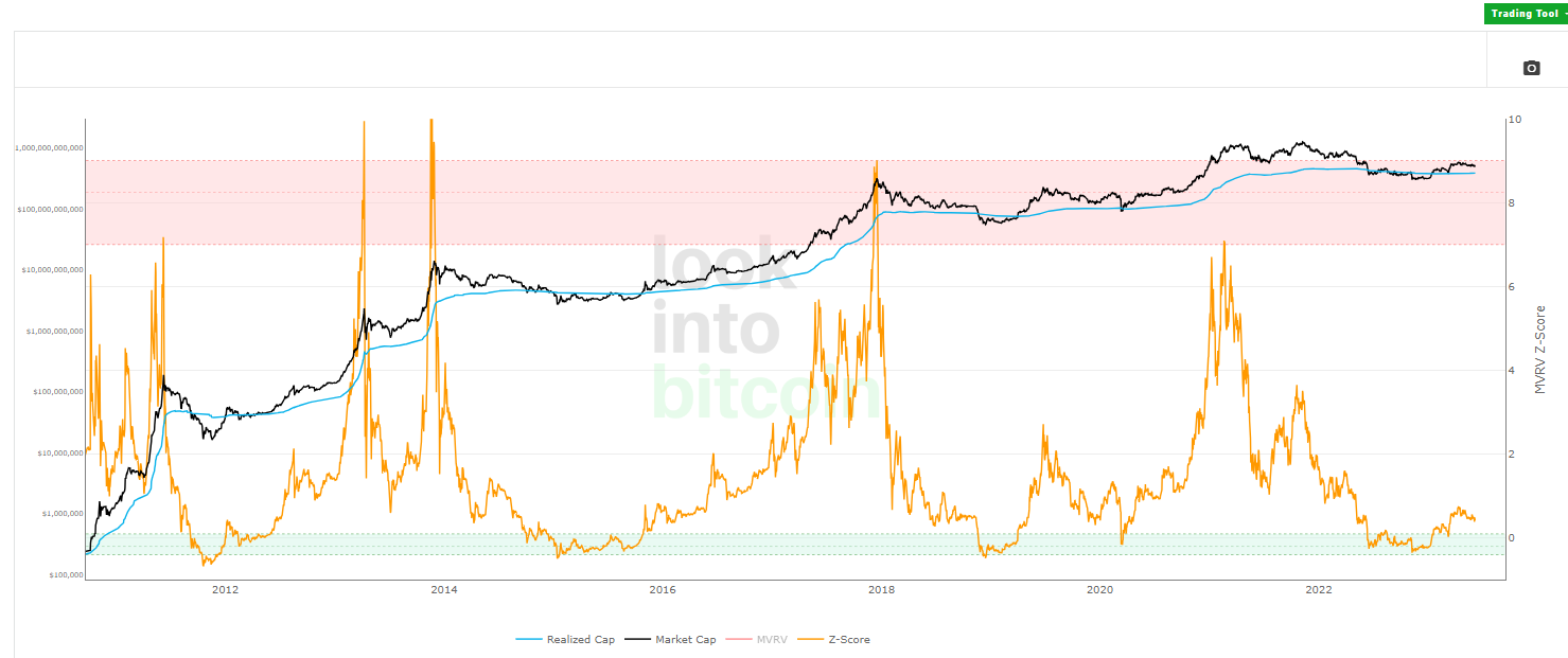
- Market Value (black line) – Marketcap: The current price of Bitcoin multiplied by the amount of circulating money.
- Realized Value (blue line) – Realized Value: Instead of using Bitcoin’s current price, Realized Value takes the price of each Bitcoin when it was last moved, i.e., the last time it was sent from one wallet to another. Then, it adds up all those individual prices and takes the average of them. Then it multiplies that average price by the total amount of circulating money. => By doing so, it removes short-term market psychology. Therefore, it can be considered a more accurate long-term measure for Bitcoin.

- Z-Score (orange line): The standard deviation between market value and realized value data.
When the market value > realized value, the red line enters into the pink area which is the peak of the market cycle.
When the market value < realized value, the red line enters into the light blue box, and buying BTC will generate above-average returns.
2-Year MA Multiplier Indicator
- Link to view the indicator: https://www.lookintobitcoin.com/charts/bitcoin-investor-tool/
The Bitcoin 2-Year MA Multiplier indicator highlights times when buying or selling Bitcoin during these periods would have generated superior returns. It tells you whether today’s Bitcoin price is historically low (in the green area), high (in the red area), or neutral (between the green and red areas). Therefore, it is a useful tool for predicting Bitcoin’s price as investors can get a relative idea of whether BTC is currently overvalued or undervalued.
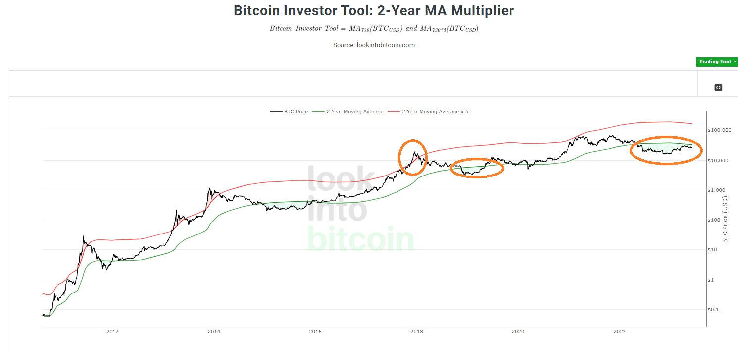
- Buy Bitcoin when the price drops below the 2-Year MA (green line), which has historically generated superior returns.
- Sell Bitcoin when the price exceeds 5 times the 2-Year MA (red line), which has historically been effective in capturing profits.
200 Week MA Heatmap Indicator
- Link to view the indicator: https://www.lookintobitcoin.com/charts/200-week-moving-average-heatmap/
Bitcoin 200 Week Moving Average Heatmap, using a color heatmap based on the percentage increase of the 200-week moving average.
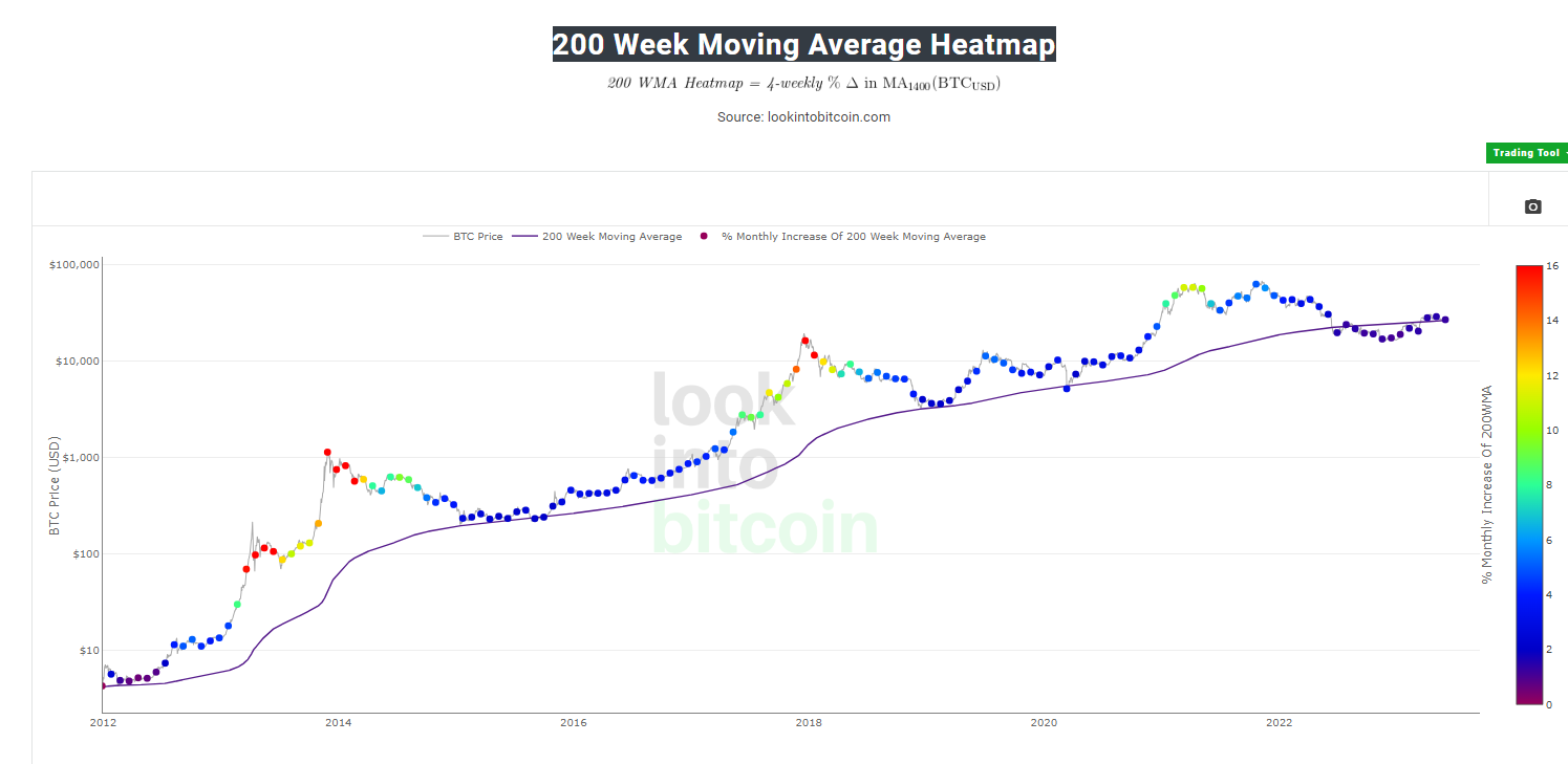
Historically, the price of Bitcoin has essentially hit the bottom near the 200-week moving average. Long-term Bitcoin investors can track the monthly color changes. Historically, when we see orange and red dots assigned to the price chart, it is a good time to sell Bitcoin when the market is overheated. Periods when price dots are purple and close to the 200-week MA have historically been good times to buy.
Net Unrealized Profit/Loss (NUPL) Indicator
- Link to view the indicator: https://www.lookintobitcoin.com/charts/relative-unrealized-profit–loss/
Best Bitcoin Indicators – NUPL – Net Unrealized Profit/Loss is calculated by taking the Market cap (Market Value) – (minus) Realized Value. If you are not familiar with Market Value and Realized Value, let me remind you once more:
- Market Value (Marketcap): The current price of Bitcoin multiplied by the amount of circulating money.
- Realized Value (Realized Cap): Instead of using the current price of Bitcoin, Realized Value takes the price of each Bitcoin when it was last moved, that is, the last time it was sent from one wallet to another.
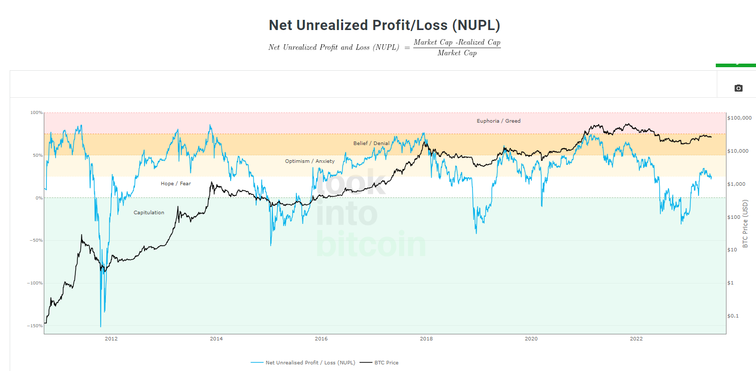
Unrealized Profit/Loss (NUPL) estimates the total paper profit/loss in Bitcoin held by investors. It is represented by the blue line in the chart above.
The utility of the Bitcoin NUPL indicator is:
- When NUPL enters the pink area, it means the market is overheated, and it is appropriate to take profits.
- When NUPL enters the blue area, it means the market has entered a suitable time for buying.
Bitcoin AHR999 Indicator
- View the indicator: https://www.coinglass.com/pro/i/ahr999
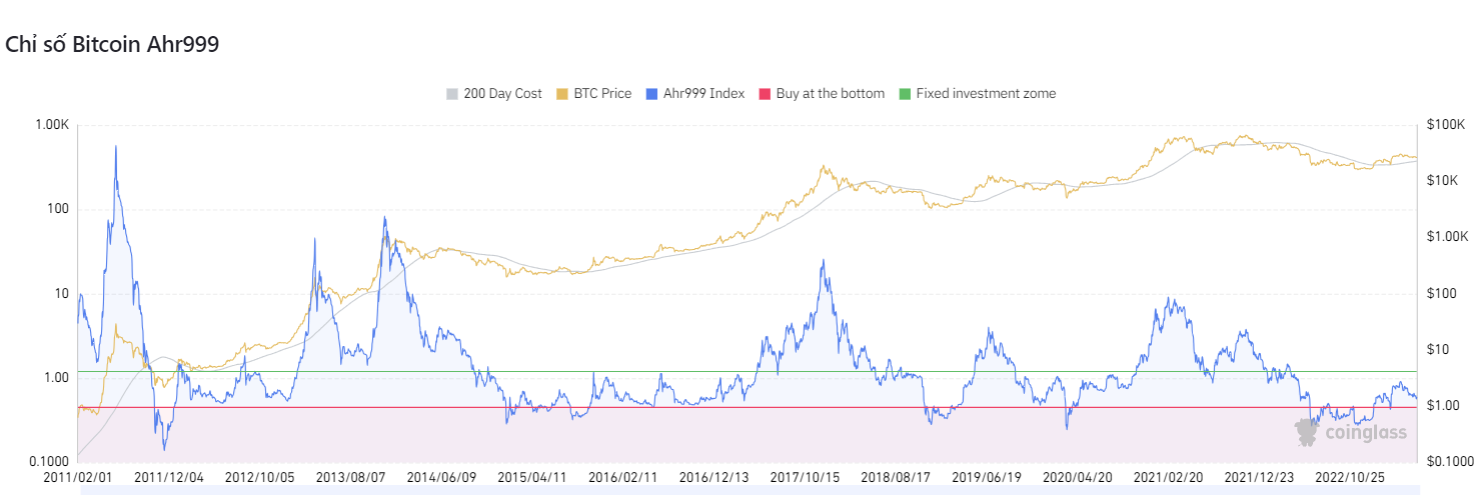
This is an index published by Weibo user ahr999 in his 2018 e-book “Accumulating Bitcoin.” It can be used to assess the PRICE of Bitcoin.
As shown in the chart above, the red line corresponds to AHR999 = 45.
- A value <0.45 means the price is at the bottom, and investors should buy in (below the red line).
- 0.45 – 1.2 means the price is reasonable and can be bought for investment (range from the red line to the green line).
- 1.2 – 1.5 is the range where the price has increased too much (selling range).
RHODL Ratio Indicator
- Link to view the indicator: https://www.lookintobitcoin.com/charts/rhodl-ratio/
This index represents the ratio of actual value holding. It is usually represented by an orange line on the chart.
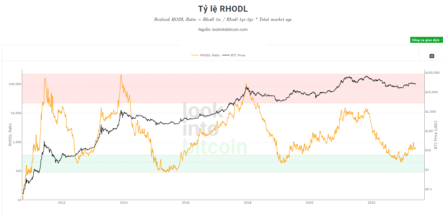
- When the orange line (RHODL) approaches the red zone, the market is overheated, and it is time to take profits.
- When the orange line (RHODL) enters the green area, the currency’s price will rise in the future, suitable for investment and regular buying.
Unlike other on-chain indicators, the RHODL ratio did not give false signals about the strong price increase in April 2013. This gives it a unique advantage over other on-chain indicators.
Bitcoin Reserve Risk Indicator
- Link to look up the indicator: https://www.lookintobitcoin.com/charts/reserve-risk/
Bitcoin Reserve Risk is a chart that allows us to visualize the confidence of long-term Bitcoin holders versus Bitcoin’s price at a specific point in time. It is represented by a red line in the chart below:
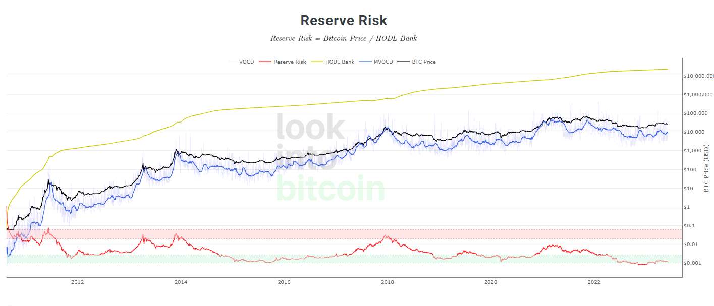
- When confidence is high and the price is low, there is an attractive risk/reward to invest in Bitcoin. At this time, Reserve Risk will enter the blue zone. Values below 0.002 are considered oversold (green area), and this is a good time to buy in.
- When investor confidence is low but the price is high, then Reserve Risk will shift to the red zone. Values above 0.02 are considered overbought (red area). At this time, you may consider selling off.
Active Address Sentiment Indicator (AASI)
- Link to view the indicator: https://www.lookimntobitcoin.co/charts/active-address-sentiment-indicator/
The Active Address Sentiment Indicator (AASI) is created by comparing the % change in Bitcoin’s price over 28 days, with the % of active Bitcoin addresses over the same period.
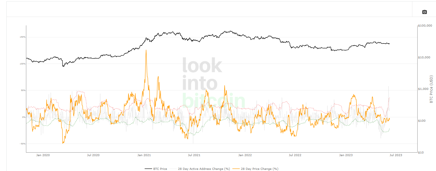
This Bitcoin indicator is interpreted as follows:
The red dotted line in this indicator is the upper boundary and the green dotted line is the lower boundary.
- When the orange line touches the red dotted line, it means the market sentiment is overheated (meaning the rate of price increase > rate of increase in active addresses). This is an appropriate time to sell.
- When the orange line touches the dotted line of the green color, it means the market is pessimistic, and it also indicates that the price will rise in the future. This is an appropriate time to buy.
These are the top 10 useful indicators for Bitcoin that you should know if you want to understand and analyze Bitcoin’s price more deeply. Of course, these indicators have certain limitations and sometimes errors, they cannot guarantee accurate market predictions. But the importance of them in on-chain analysis, helping you have a more comprehensive view of Bitcoin, cannot be denied. The important thing is to know how to apply flexibly, combine with many other analysis methods: fundamental analysis, technical analysis, market trends… to make the right investment decision. If you still don’t understand something, just leave a comment below for me to answer. Thank you for reading the article and wish you successful investment.


