In technical analysis, MACD is an important and useful indicator for investors as it helps you track market fluctuations and identify trends to make appropriate trading decisions. And if you don’t know what is the MACD Indicator, read this article to learn how to best use the MACD indicator.
Contents
What is the MACD Indicator?
MACD stands for Moving Average Convergence Divergence, meaning convergence and divergence of moving averages. With this indicator, investors can easily identify the movements of trends in the near future, thereby making appropriate buying and selling decisions.
MACD was created by Gerald Appel in the late 70s and is often known as a lagging indicator, as its results are based on past data, on what has already happened. However, as a lagging indicator, its results are safer, helping to reduce misleading signals when the market is volatile.
Structure of the MACD Indicator System
Before delving into what MACD is, make sure you are familiar with MA (Moving Average) Indicator.
The MA moving average helps us identify trends and trend reversals. Gerald Appel developed not just one, but a combination of 3 MAs together to create an extremely useful indicator, the MACD, with the full name: convergence and divergence of moving averages.
The MACD indicator system consists of 3 main parts: the MACD line, the Signal line and the MACD Histogram chart.
The MACD Line
The MACD Line, also known as MACD Line, is calculated based on the 12-day and 26-day closing price moving averages (EMA 12 and EMA 26). The difference between these two lines gives us the MACD Line – playing a role in identifying market trends.
Formula::
MACD points are connected to each other, forming an indicator line. If the EMA 12 is above the EMA 26, the MACD Line will return a positive value. Conversely, if the EMA 26 is above EMA 12, the returned value will be negative.
The MACD Line is usually represented in orange or red on the chart.
The Signal Line
The Signal Line, also known as the signal line. This line, when combined with the MACD Line, creates good trading signals such as: Buy, Sell, Reverse signals helping investors find good entry points.
Formula:
Meaning, the Signal Line is the 9-day average of the MACD Line itself. The Signal Line is usually represented in blue on the chart.
Then, combining these two lines into one chart gives us a MACD indicator. It will be displayed as in the image below, with the MACD Line in red and the Signal Line in blue.
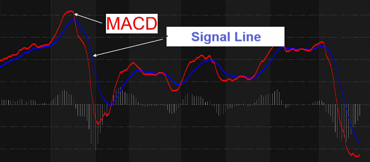
Like some other technical indicators, the MACD indicator is often displayed independently, below the price frame for easy comparison. You can add this indicator to any chart by searching in the Indicators section.

The MACD Histogram Chart
The MACD Histogram is just one component of the MACD indicator, but the MACD Histogram itself is an extremely useful tool, showing the difference between the MACD Line and the Signal Line.
Formula:
The obtained difference is represented in the form of bars. If the MACD Histogram >0, its chart will point upwards, and if MACD Histogram < 0, the chart will point downwards.

The Zero Line
Additionally, you should also pay attention to the Zero Line in this indicator set. This is a straight line with a value of 0 in the MACD display area. This line acts as a reference line for the MACD indicator, helping investors to assess whether the trend is strong or weak.
Guide to Trading with the MACD Indicator
How to use the MACD Line? With the MACD indicator, you can use it for various purposes. Below are the main ways you can refer to:
Crossing between the MACD Line and the Signal Line
Moving averages (MA) represent price consensus over a period. The MACD Line, being derived from MAs, also represents price consensus over a short period.
Furthermore, the signal line, being the average of the MACD Line, represents consensus over a longer period. Therefore, the crossing of MACD and the signal line creates the following indicators:
- When the MACD Line crosses below the Signal Line, it shows strong selling pressure, prices may fall => Consider placing a SELL order
- When the MACD Line crosses above the Signal Line, it indicates increasing buying pressure, likely leading to a rising trend => You can place a BUY order.
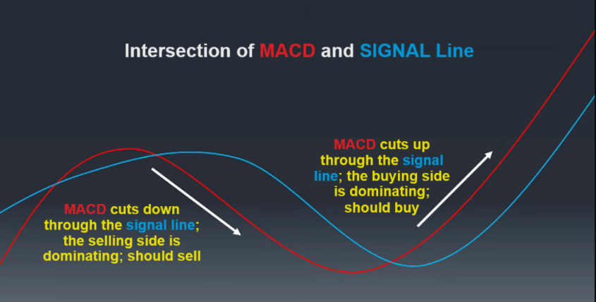
To clarify, let’s look at the example below:
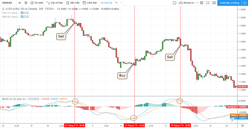
As you can see, the marked points in the figure are where the MACD Line and the Signal Line intersect. Trading in this way is relatively simple and easy to understand.
However, due to its simplicity, this method also has several drawbacks, such as when you enter a trade, it often falls at the end of a trend, so the effectiveness is not high. Therefore, consider and combine more signals and indicators before deciding to enter a trade.
Based on the Slope of the MACD Histogram
As I mentioned above, if the MACD Line crosses above the Signal Line, it is a sign that buyers are controlling the market. However, you might wonder how strong this control is, whether it will continue to strengthen or weaken, and when sellers will return?
The MACD Histogram was created to help you answer this question. The slope of the MACD Histogram changes due to the distance between the MACD and the Signal Line. The essence of the MACD Histogram is that it indicates which side is dominating the market.
- An upward sloping MACD Histogram indicates that buyers are becoming stronger.
- A downward sloping MACD Histogram indicates that sellers are becoming stronger.
Note that the slope is more important than whether the MACD Histogram is > 0 or < 0.
Why is that? Let me explain further with the example below:
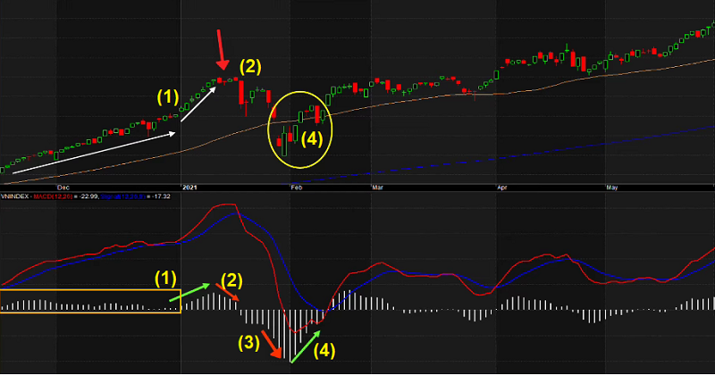
– (1) You can see that in this phase, the price is rising, and the MACD Histogram is always above the Zero Line.
– (2) However, the rapid price increase may cause many people to want to take profits, sell orders begin to appear, weakening the buyers, and the MACD Histogram starts to slope downwards (though still > 0). This shows that buyers are still dominating the market, but have started to weaken, while selling strength is gradually increasing.
– (3) Sellers continue to strengthen, causing the price to fall further, pushing the MACD Histogram below the Zero Line.
– (4) The market then continues to adjust downwards, the MACD Histogram becomes larger and steeper. At the end of the downtrend phase, when sellers start to leave the market and buyers begin to return, the MACD Histogram starts to slope upwards (though still < 0), and the market returns to an upward trend.
As you can see, trading with the MACD Histogram does not mean choosing to buy when the MACD Histogram > 0, or sell when the MACD Histogram < 0 as many guides suggest. The essence of it is that you must catch the right phase when the MACD Histogram starts to slope up or the MACD Histogram starts to slope down.
So how should you trade with the MACD Histogram?
Many investors liken investing to planting, and the movement of the MACD Histogram is no different from the 4 seasons SPRING – SUMMER – AUTUMN – WINTER.
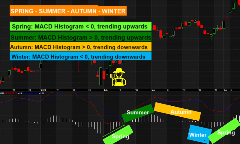
- Spring: The best time to sow seeds, when the MACD Histogram < 0 but has started to slope upwards.
- Summer: the season to start reaping the fruits, when the MACD Histogram > 0 and is still sloping upwards.
- Autumn: the latest time to harvest, when the MACD Histogram > 0 and is gradually sloping downwards.
- Winter: the cold season and time to stop planting, when the MACD Histogram < 0 and is sloping downwards.
Apply this planting analogy to trading. BUY at the time of sowing, SELL at the time of harvesting. In winter, stay out of the market and wait for the next spring signal.
Note: winter may last longer than expected, and there may be a few “warm days.” Evidence is that you will see several periods where the MACD also starts to slope upwards. This has misled many into thinking it’s “spring,” hastily sowing seeds, but then having to endure losses.

To overcome this and avoid false BUY points, combine other technical indicators, or look for the slope signal of the MACD Histogram on a larger time frame for more reliable signals. This is like waiting for a week of warm weather before sowing seeds, instead of concluding that spring has returned after just one sunny day.
Divergence between Price and MACD Histogram
The divergence between price and MACD Histogram occurs when the price forms a new lower low or a new higher high, but the MACD Histogram does not. They can be categorized into: Positive Divergence and Negative Divergence.
-
Positive Divergence: Price forms a new lower low, but the MACD Histogram forms a new higher low. ⇒ Signal of the end of the downtrend, and the market has formed a bottom.
-
Negative Divergence: Price forms a new higher high, but the MACD Histogram forms a new lower high. ⇒ Signal of the end of the uptrend, and the market has formed a top.
A mandatory condition in positive/negative divergence is that the MACD Histogram must break the Zero Line between the two highs or two lows.
Example:
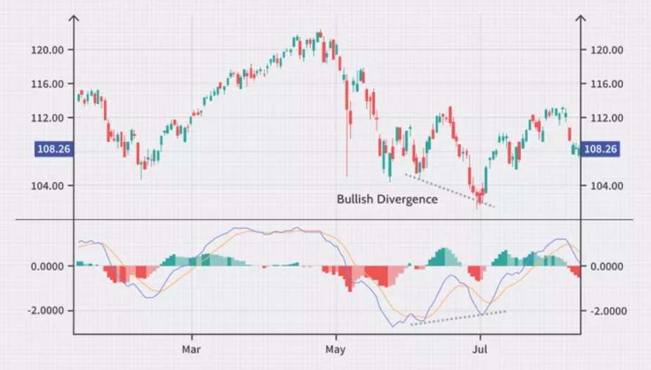
– The price is in a clear downtrend, forming a bottom and quickly recovering. However, significant selling pressure still exists, causing the price to adjust further and form a second bottom lower than the previous one.
– But in the MACD Histogram chart below, it forms a new bottom not lower than the previous one.
– Additionally, the MACD Histogram has also broken the Zero Line between the two bottoms.
⇒ The positive divergence signal has appeared, and you can start with BUY orders.
Or here is an example of Negative Divergence in the MACD Histogram:

Using MACD on Two Timeframes
Of course, any indicator is only predictive and has a certain probability of being wrong. That is why we want you to read this section carefully: choose two timeframes to increase the accuracy of trading.
- If you are trading on the D1 timeframe, your higher timeframe is W1.
- If you are trading on the H4 timeframe, your higher timeframe is D1.
- If you are trading on the H1 timeframe, your higher timeframe is H4.
Example: You trade on the H4 timeframe, the higher timeframe is D1.
Step 1: Determine the trend on the D1 timeframe.
- If the MACD Line crosses above the Signal Line, the trend on D1 is upward => only look for BUY points on the H4 timeframe.
- If the MACD Line crosses below the Signal Line, the trend on D1 is downward => only look for SELL points on the H4 timeframe.
Step 2: Find entry points on the H4 timeframe.
- For BUY points: Wait for the MACD Line to cross above the Signal Line on the H4 timeframe.
- For SELL points: Wait for the MACD Line to cross below the Signal Line on the H4 timeframe.
Through the content I have introduced above, I hope that you will grasp some key points about the MACD indicator as follows:
-
MACD is a trend indicator, with the formula EMA (C, 12) – EMA (C, 26).
-
The MACD indicator system consists of 3 main parts: the MACD Line, the Signal Line, and the MACD Histogram chart.
-
MACD crossing below the Signal Line => Price decrease signal. MACD crossing above the Signal Line => Price increase signal.
-
An upward sloping MACD Histogram indicates stronger buying. A downward sloping MACD Histogram indicates stronger selling.
-
Combining the slope of the MACD Histogram with the Zero Line will help you find the most effective BUY and SELL entry points.
-
Positive Divergence in MACD Histogram signals a market reversal to an uptrend. Negative Divergence in MACD Histogram signals a market reversal to a downtrend.
Above is all the information about how to use the MACD indicator that invest286.com wants to share with you. If you have any questions, please leave a comment below for us to answer. I hope this knowledge will help you invest safely and effectively. Good luck!


